Smartphone review
The Nothing Phone (2a) smartphone raises the bar for mid-range devices
The company established by the founder of OnePlus launches its third device, and maintains the unique design. In terms of specifications and performance, it competes against other mid-range devices, and in terms of price, it wins by a large margin
Top Line:
The Nothing Phone (2a) is a fun and light device that proves how you can make a good and cheap mid-range model. It has disadvantages: the cameras need improvement, so does the protection against water and dust, there is no wireless charging, the back cover is made of plastic (albeit of high quality) and the front has Gorilla Glass, but an old model. On the other hand, this is what makes it a mid-range device.
Based on the performance, design and specifications, I expected a higher price, but you should be able to buy it for around $350, significantly cheaper than some of its mid-range competitors.
The price gives the final stamp of approval and makes the 2a one of the most recommended (and successful) devices in the category.
Details:
Take a powerful smartphone that has nothing to be ashamed of in front of the competition, with good specifications, quality assembly, a different design than usual and a relatively low price - and what do you get? OnePlus, for example. But not only that: Carl Pei, one of the founders of the successful company, left it about three years ago, founded a new venture called Nothing and is basically doing the same thing - launching powerful devices, with a unique design and a low price.
Last week Nothing launched the Phone (2a), its third phone overall (a year and a half after launching its first smartphone). After two mid-range plus devices, which were sold at a not particularly high price, the company decided to produce a discounted device - but it doesn't really feel like one. In general terms, it resembles its predecessor, the Phone (2), with some changes.
We took the new model for testing and discovered a serious contender for the leadership of the mid-range device category.
More Smartphone Reviews:
Design and structure: faithful to the Nothing line
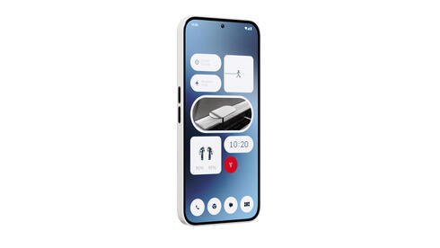
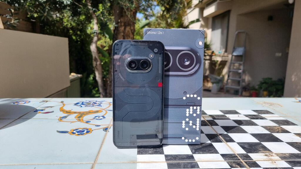
As mentioned, this is only Nothing's third device, but it has certainly managed to produce its own "design language", with one of the most prominent features being the transparent back. The general structure is reminiscent of an iPhone or a Samsung Galaxy S series device - a 6.7 inch flat screen, rounded corners and a small selfie camera. The device actually does not feel particularly large and despite a weight of about 190 grams it does not feel heavy either.
On the right side is the power button, on the left side are the volume keys, an arrangement similar to the iPhone and different from what is customary in many Android devices. At the bottom there is a charging socket and a SIM tray, and there is no connection for wired headphones.
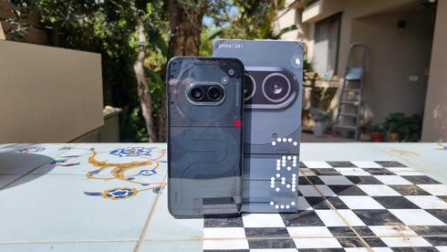
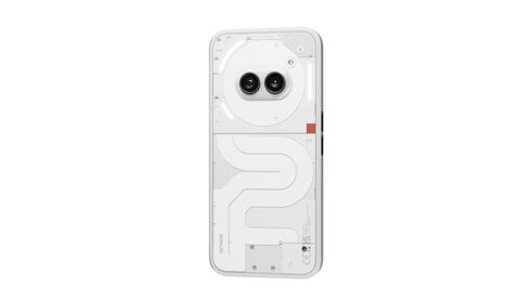
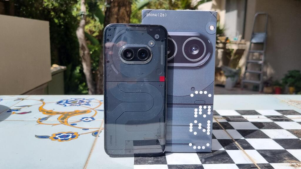
Two camera lenses stand out from the transparent back (yes, only two, for cost cutting reasons), which are in the center of the device and resemble eyes, also because under the transparent back is a large circle that looks like a head.
The screen is protected by Gorilla Glass 5 - the same glass that was also in Nothing's first device, meaning it is not new, but strong enough. The back cover is made of transparent plastic (to reduce costs), which does not feel cheap, but does collect fingerprints and smears. On the Nothing Phone (2) the back was made of convex glass and was very slippery. This time the cover is flat and more comfortable to hold.
In terms of protection, the 2a is similar to the 2 and complies with the IP54 standard, so it should deal at a fairly basic level with dust and splashes of water, but not with immersion in water.
Contrary to the rumors that preceded the launch, the company did not give up another unique feature - the Glyph, meaning LED lights that are on the back of the device and display various notifications. This time it was satisfied with only 3 lighting areas, and in the settings you can determine when they will be activated: together with the ringing of an incoming call, update that a new message has been received, display the volume level of the device and more. It is also possible to determine that the lighting will adapt itself to the music you are listening to, and it does so in a good way, and to customize the lighting style.
It's a successful gimmick, but still mostly a gimmick. If you place the device on its back, it is not really relevant because that way the lighting is hidden. If you place the phone with the screen facing down you will be able to see the notifications, assuming that over time you will remember what each sequence of flickering lights signifies. By the way, as in the previous devices, there is a Flip to Glyph setting here that will automatically switch the phone to silent mode when you turn it over and place it with the screen facing down and continue to display lighting notifications.
Hardware: In the first line of mid-range devices
Under the hood, the 2a runs Mediatek's Dimensity 7200 Pro processor, and the model that arrived for testing had 12 gigabytes of RAM and 256 gigabytes of storage. In the settings menu, you can choose to allocate part of the storage volume as an addition to the RAM memory, from 2 gigabytes to 8 gigabytes.
This is a specification that puts it in competition with devices such as the Focus X6 Pro or, for example, the Redmi Note 13 Pro Plus. In terms of performance, it compares to or surpasses such devices - the 2a responds quickly, even if it is not the most agile device, withstands the load of daily tasks and what's more, it also handles games and I didn't feel it heat up.
The screen is very good, with a good color display and a brightness that reaches a maximum of 1,300 nits, so there is no problem using it even in the sun, but you can also see reflections of the person holding the device and the surroundings, at a level that does not really interfere with its use.
The speakers are good and even surprised me from time to time - if you are close enough to the device (and you don't have to be close to it) you can hear stereophonic sound, with the audio being divided between the different sides. When watching a movie on Netflix, for example, I felt the sound and the effects enveloping me.
What was a bad surprise was the lack of an eSIM - true, it's a cheap mid-range device, but some competitors already have one and in 2024 we can expect more.
The 2a is powered by a 5,000 mAh battery that lasted a whole day without problems. The kit does not include a charger and to save costs Nothing gave up wireless charging. There's a charging cable, of course, and a statement of 45W charging support, but even when I used a 65W charger and the phone said it was fast charging, it was pretty slow. According to the company, 23 minutes will be enough to charge the device from 0% to 50%, but in a home test (with a suitable charger) the battery went from 15% to 50% in 20 minutes and a full charge required a little less than an hour.
Related articles:
Interface and software: a minimalist approach
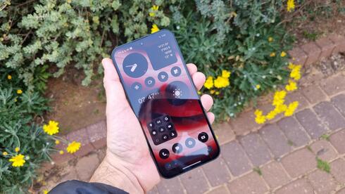
The operating system of the 2a is Nothing OS 2.5 which is based on Android 14 and is very close to a stock version of Android. The default is navigation using hand gestures and not using buttons at the bottom of the screen (something that can be changed in the settings) and a black-and-white display of icons, with the Nothing font, which looks like it came out of an old Dot Matrix printer. The manufacturer prides itself on not burdening consumers with unnecessary apps, and it's true - there are a few widgets and apps that come with the device, including Google's collection of apps, of course, and that's it. No additional games or recommendations, and no installation of a line of applications that you didn't ask for.
The choice of a black-and-white display of the applications depends on personal taste - there is something beautiful about it in terms of design, but for me it was difficult from a practical point of view. True, it's sometimes hard to find the app you want among a bunch of icons with a similar color (why are there so many in light blue or blue?), but when the majority is displayed in black and white it's even more complicated. And there are also apps that don't comply with Nothing's interface and their icon is displayed in the colored version in any case. This can also be changed at any time in the settings screen.
Beyond all that, those who use Android shouldn't have a problem getting used to Nothing's interface, even if it's a little different from that of Samsung or Xiaomi, for example. There is an app drawer and also shortcuts on the main screen and the basic usage is very similar.
Camera: Less is enough
There are companies that load as many megapixels as possible, even if the camera is not really of high quality (with advertisements about a "200 megapixel camera!") and there are some that are "satisfied" with "only'' 50 mega pixels. In any case, in most devices you will find at least 3 lenses. Nothing, for its part, shows again that there is actually another way - as in the Phone 2, there are only two lenses, each with a 50 megapixel sensor, and a selfie camera with a 32 megapixel lens.
My test showed that this is enough: these are not the best cameras in the field, obviously, but photos in daylight look very good, so does shooting inside a lighted hall. The camera automatically switches to night mode and provides good photos in such a scenario as well. So why is it just enough? First of all, because there is no optical zoom, at all. There is an 2X digital zoom and you can easily see the difference - it enlarges the frame, but the result is not sharp. Another reason: even when shooting without zoom, a slight enlargement of the image will sometimes result in blurry parts.
The camera does not include any AI assistance for choosing a suitable shooting mode and the photos further testify to Nothing's minimalism - it does not have its own application for displaying photos, it simply uses Google Photos, with its editing options.
